This from Josh Boyajian:
Engine Co. 117’s house was recently repainted, here is an updated shot along with the engine & tower.
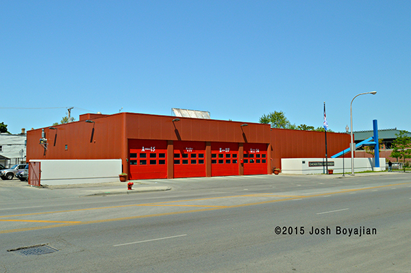
Chicago Engine 117’s house after being painted. Josh Boyajian photo
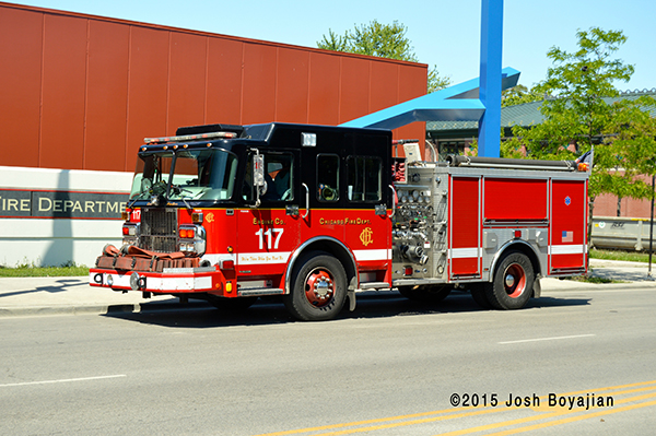
Josh Boyajian photo
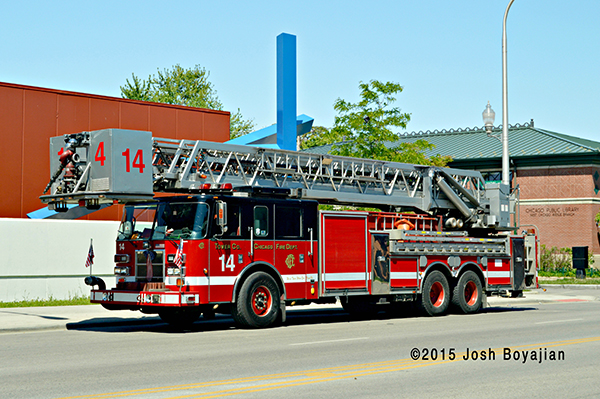
Josh Boyajian photo
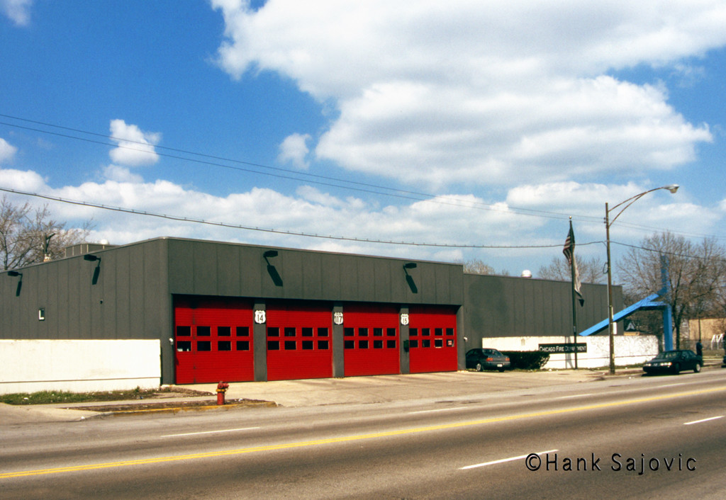
Engine 117’s house previously. Hank Sajovic photo












#1 by tom sullivan on May 27, 2015 - 2:15 PM
never looked so good,,, from a distance, those early 80s’ houses left a lot to be desired,, designed & speced out by people who never spent one day ,,or night in firehouse.
the guys over the years had to ,,and still do adjust to inherent design flaws.
still with that said, the houses continue to be home away from home for some of the greatest people I have ever known.
#2 by Mike L on May 27, 2015 - 12:49 PM
The split level designs are, my opinion, best firehouses around. Not saying the best looking… Maximization of space without losing any function in a small footprint (relative to if it was all on one level). As for Eng 117’s quarters, it has seen its share of makeovers since it opened. This orange is a little more inviting than the dark grey. Great house and great companies!
#3 by Crabby Milton on May 27, 2015 - 5:47 AM
Well, I guess it just depends who approves the designs on any given day. Some prefer the “warehouse” look while others prefer the sentimental syle with some lawn and trees. I prefer the latter but as long as it serves the purpose, that’s what the tax payers care about.
Hey, at least the apparatus look sharp.
#4 by harry on May 27, 2015 - 1:39 AM
it was ugly b4 and it is still ugly i think it is the color mostly
#5 by Crabby Milton on May 26, 2015 - 5:32 PM
Looks more inviting now. Looks like the construction company left some beams on the… oh…that’s what they call art nowadays.